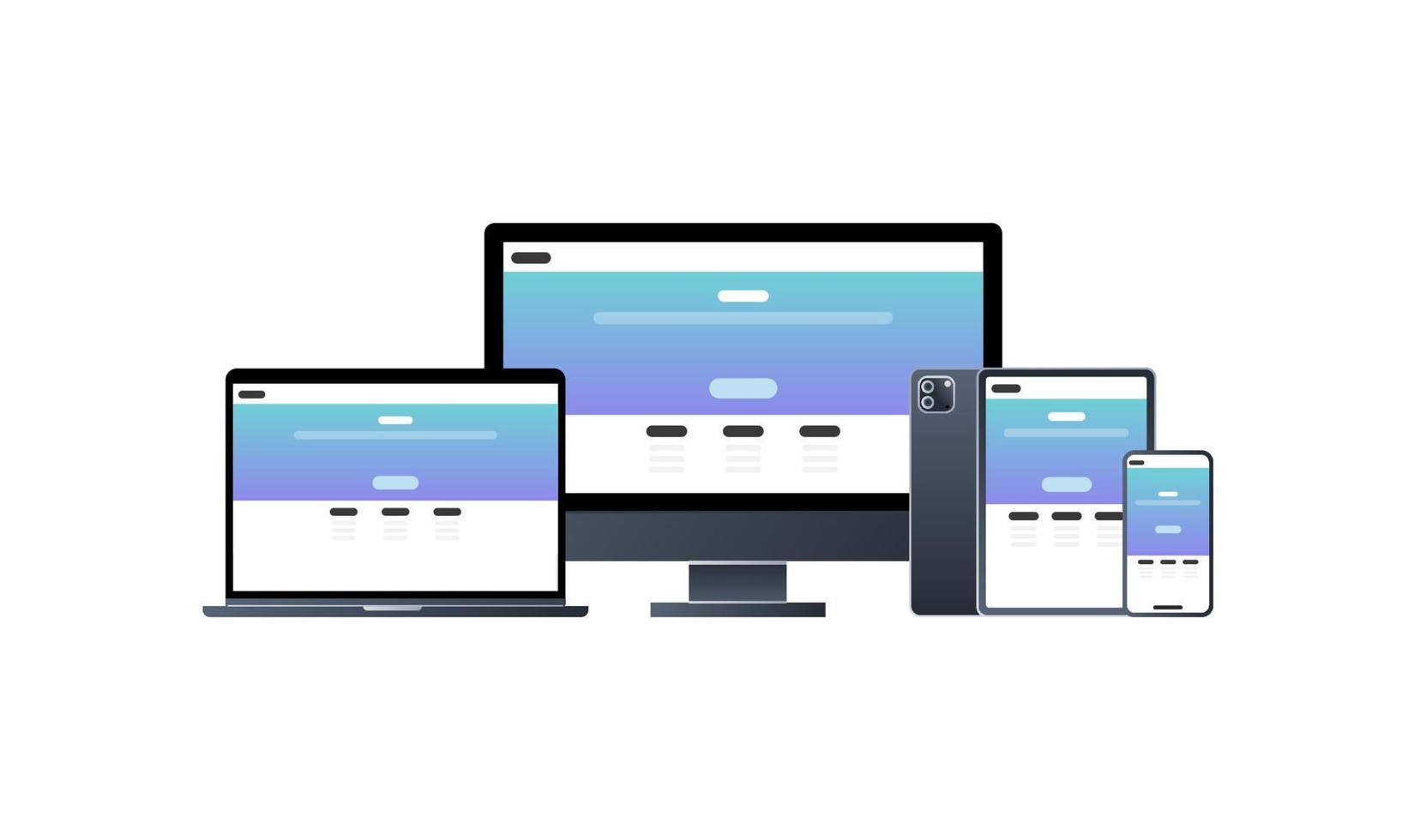
Responsive Design: Maintaining Proportions Across Devices
Published on June 18, 2024
The Challenge of Responsive Proportions
In today's multi-device world, maintaining consistent visual proportions across different screen sizes is one of the biggest challenges in web design. Users expect websites to look good and function well whether they're viewing on a desktop monitor, tablet, or smartphone.
When it comes to images, videos, and other media elements, preserving aspect ratios is particularly important. Distorted images or awkwardly cropped videos can ruin the user experience and reflect poorly on your brand.
Understanding the Basics: Aspect Ratio in Web Design
Aspect ratio in web design works the same way as in photography or video—it's the relationship between width and height. However, in responsive design, we need to consider how these ratios behave when container widths are fluid rather than fixed.
Common Challenges
- Images stretching or squishing when screen sizes change
- Videos breaking layouts or becoming too small on mobile devices
- Hero sections and banners losing their visual impact at different breakpoints
- Maintaining readable text overlays on images across devices
CSS Solutions for Maintaining Proportions
The Padding-Bottom Technique
One of the most reliable methods for maintaining aspect ratios in responsive design is the padding-bottom technique. This approach uses CSS's percentage-based padding, which is calculated relative to the element's width.
.aspect-ratio-container {
  position: relative;
  width: 100%;
  height: 0;
  padding-bottom: 56.25%; /* For 16:9 aspect ratio */
}

.aspect-ratio-content {
  position: absolute;
  top: 0;
  left: 0;
  width: 100%;
  height: 100%;
}
The magic number in this technique is the padding-bottom percentage, which is calculated as (height ÷ width) × 100%. For common aspect ratios:
- 16:9: padding-bottom: 56.25%
- 4:3: padding-bottom: 75%
- 1:1: padding-bottom: 100%
- 3:2: padding-bottom: 66.67%
Modern Solution: aspect-ratio Property
Modern browsers now support the aspect-ratio CSS property, which makes maintaining proportions much simpler:
.modern-container {
  width: 100%;
  aspect-ratio: 16 / 9;
}
This property is cleaner and more intuitive than the padding trick, but you may still need to provide fallbacks for older browsers.
Object-fit for Images
The object-fit property is essential for responsive images. It controls how an image should be resized to fit its container while preserving its intrinsic aspect ratio.
.responsive-image {
  width: 100%;
  height: 300px; /* Fixed height */
  object-fit: cover; /* Image will cover the area, cropping if necessary */
}

/* Alternative approach */
.contain-image {
  width: 100%;
  height: 300px;
  object-fit: contain; /* Image will be contained, with possible whitespace */
}
Responsive Video Embeds
Video embeds from platforms like YouTube or Vimeo present special challenges for responsive design. Here's how to handle them:
.video-container {
  position: relative;
  width: 100%;
  padding-bottom: 56.25%; /* For 16:9 videos */
}

.video-container iframe {
  position: absolute;
  top: 0;
  left: 0;
  width: 100%;
  height: 100%;
}
Responsive Images with Different Aspect Ratios
Sometimes you need different aspect ratios at different screen sizes. For example, a landscape image on desktop might work better as a portrait or square on mobile.
Using the picture Element
<picture>
  <!-- Mobile: 1:1 aspect ratio -->
  <source
    media="(max-width: 640px)"
    srcset="image-square.jpg"
  >
  <!-- Tablet: 4:3 aspect ratio -->
  <source
    media="(max-width: 1024px)"
    srcset="image-4-3.jpg"
  >
  <!-- Desktop: 16:9 aspect ratio -->
  <img
    src="image-16-9.jpg"
    alt="Responsive image with different aspect ratios"
  >
</picture>
CSS Approach with Media Queries
.responsive-container {
  width: 100%;
  aspect-ratio: 16 / 9;
}

@media (max-width: 1024px) {
  .responsive-container {
    aspect-ratio: 4 / 3;
  }
}

@media (max-width: 640px) {
  .responsive-container {
    aspect-ratio: 1 / 1;
  }
}
Best Practices for Responsive Proportions
1. Plan for Multiple Breakpoints
Don't just design for desktop and mobile—consider tablets and larger phones as well. Test your designs at various widths to ensure smooth transitions.
2. Use Flexible Units
Prefer percentage-based widths and viewport units (vw, vh) over fixed pixel values when possible.
3. Consider Art Direction
Sometimes maintaining the exact same aspect ratio isn't ideal. Art direction—using different crops or compositions at different screen sizes—can provide a better user experience.
4. Optimize for Performance
Use responsive images with the srcset attribute to serve appropriately sized images to different devices, reducing load times on mobile.
5. Test on Real Devices
Browser emulators are useful, but nothing beats testing on actual devices to ensure your proportions look good in real-world conditions.
Tool Recommendation
When planning responsive layouts, our Aspect Ratio Calculator can help you quickly determine the exact dimensions needed at different breakpoints while maintaining consistent proportions.
Common Pitfalls to Avoid
Forcing Dimensions
Avoid setting both width and height as fixed values unless you're also using object-fit for images or overflow properties for containers.
Ignoring Text Scaling
Remember that text overlaid on images needs to remain readable at all screen sizes. Test text legibility across devices.
Overriding User Preferences
Be cautious about preventing zooming or scaling, as this can create accessibility issues for users with visual impairments.
Conclusion
Maintaining proper proportions across devices is a fundamental aspect of responsive design. By understanding aspect ratios and implementing the techniques outlined in this article, you can create web experiences that look polished and professional on any screen size.
Remember that responsive design is about more than just making things fit—it's about creating optimal experiences for users regardless of their device. Sometimes this means adapting proportions rather than rigidly maintaining them, always with the goal of presenting your content in the most effective way possible.